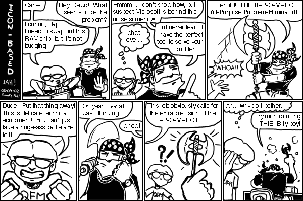
Image Of The Day: Icon-Based - "Bap-O-Matic"

CLICK OR YIELD TO THE BAP-O-MATIC! (42.2k)
I worked on this comic last night, but I started too late in the evening to finish before exhaustion took its unforgiving toll, so here it is a day later than intended.
WARNING: This strip is not necessarily funny. It was based on a suggestion from Pat, but nothing here is to be considered his fault. The joke was perfectly served by Pat's one-line IRC message to me, but it sounded like it would be fun to draw so I went for it. I didn't put much effort into the dialog this time. My goal was to see if I could do a better job on the art than the last Icon-Based, and at least there I think I succeeded. The rule seems to be that Mtn. Dewd has to be shaking his fists in frustration by the 3rd or 4th panel. Hey, it's a winning formula!
Icon-based newbies should read this old gem from four years ago for the first appearance of the BAP-O-MATIC. That one is a favorite of mine across the whole IB/Bastich canon.
This also marks the return of the bearded BAPPER! Yay! Just in time for the real Bapper to announce that he's once again clean-shaven yuppie scum. Well, I give up, man! Bapper and Mtn. Dewd are staying AS IS from now on! Quit getting married and cutting your hair, ya freaks!
I have fond memories of the original Icon-Based days. I spent a great deal of my last semester at Chico State hanging out at the Pat-and-Bapper pad. I was kind of going through a "rough patch" at the time, so I really appreciate the friendship they offered, which helped keep me sane. They were also an excellent source of material. Most of the old "Icon-based" strips were group written or at least inspired by some conversation we had over too many beers. I have a folder full of unused ideas from those guys, most of it indecipherable after all these years. It was just a huge, fun time, that eventually had to end when we all packed up and headed off to start our "adult" lives...
Bwah-hah-hah-hah!
PS: Sorry about the gnarly font. I built the whole thing out at 4x its published size, and Helvetica doesn't look quite as good at 10pt as it did at 40. Oh well. Back to the hellspawn, Arial!
